Thursday 12 July 2012

Sustainable Seafood Australia

I completed this project in conjunction with Jennifer Williams, Ian Gwilt, Freda Chu and Tegan Hendel at UTS for the Australian Conservation Foundation. Here is my development sketches, the final result, and the really really annoying reason it couldn't be patented...

Initially I gravitated towards creating a pattern...


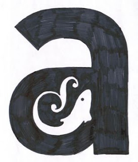
Really wanted to try to do something typographic, so created these in my bathtub! 


Something quite symbolic (like yin & yang) came out of this configuration...


The ACF were delighted with the finished result, however as luck would have it, this logo had already been beaten to the punch... I really don't see the stylistic similarity, however at the end of the day, it is ANOTHER sustainable seafood company with two fish making an S... 


Blame the Internet

Whilst I know how great the internet is, and what it provides is pretty much immeasurable, I think there is also negatives that come with it, particularly in the design sense.

The internet has quite literally liberated and democratised the graphic design community, where one is no longer limited by the country that they live in (very fortunate for Australia).
However with all of the blogs and design communities out there, I don't think there has been a greater time where it is as difficult for designers to find their point of view, particularly with the emergence of blog trends and fads.

Donald Horne's book "The Lucky Country", written at a time where no one had even considered the internet, outlined that Australia in it's taste and design sense was quite literally doomed, and constantly accuses us of never having a mind of its own. Some would argue that the internet has clearly changed this, however I would argue that the internet may have done otherwise for design...
Vince Frost, owner of Frost* Design even stated in a video I watched of him: "There is more of an international look to things today, it's no longer an English or an American or Japanese look."

My point therefore is this: whilst I can definitely appreciate what the internet provides, it can also create a division of "sameness". I suppose with all of the design blogs and graphic material out there, it isn't surprising that junior designers starting out struggle to find their point of view, and furthermore feel intimidated and down on themselves as they are constantly exposing themselves to the output of long running studios.

I think we just need to put our head down, bum up, ipod on and pay no attention to what our global or local neighbours are doing, because otherwise we just go round in circles copying each other.

Saturday 7 July 2012

Religious Signs

I just came across this research that I collected for my major project at university! A heap of American Christian signage - quite interesting forms of communication!


Friday 6 July 2012

Old book covers

I love looking and finding inspiration from old book covers, I think we have such a tendency to go charging ahead with design, but I think it's important to look back now and then.


Wednesday 4 July 2012

What's The Point?

Sometimes I get the feeling (particularly as I try and explain what I do to people in a noisy, crowded club to drunken 20 something year olds, (or to some of my older relatives) that the graphic design industry on the surface seems shallow. I think I would be lying if I said it didn't concern me. Why do I get nervous or seem less of a professional by saying that I'm a graphic designer (don't even get me started trying to explain the term visual communication).

I really don't think any other related field has this sort of inferiority complex, such as fashion, industrial design and interior design. Each of these fields immediately conjure up instantly recognisable professions, however my vocation seems to have a vagueness about it.

I initially began my course as a non-current school leaver, whereby instead of being automatically accepted into uni through my marks, I had to go through an interview and present a portfolio. On the open day when I was sussing out the course, a great Typographer / Lecturer, Louise McWhinnie spoke about the interview process and her experience on having to sit and interview about 100 odd students. After a while of seeing unmotivated candidates, she began to ask the interviewees: What is the best piece of graphic design that they have seen? This question has stuck with me, as it pointed out that even then I couldn't answer that question. Even more frightening was that I was stuck on what the actual term "graphic design" even meant!

I guess it doesn't present an optimistic future for graphic design if even the students applying to study it don't even fully understand what it is... Or maybe we were just moody teenagers that just finished Art Express in high school...

Whenever I doubt my profession or start to feel that what I do is meaningless, I watch this gorgeous TED talk by Marian Bantjes, always an inspiration.

Marian's TED Talk

I really hope I can be as confident & eloquent as this great designer one day...


Monday 2 July 2012

Flexible Brands

Having the task of branding a community or organisation can prove problematic, particularly when that organisation stands for a whole range of people. I have begun to seek out brands that evolve over time. I read in desktop magazine that sometimes there doesn't have to be a one size fits all solution to branding, yes the organisation needs an identity, but sometimes us designers go a touch too far on the control freak side of us; dictating photography, typographic styles and pretty much anything with a shape or colour to it within the organisation's communication.

Here are some case studies that I found particularly compelling, making me go damn, why didn't I think of that!


As part of its redesign series, “Studio 360,” a radio program hosted by Kurt Andersen and produced by WNYC and PRI, decided to tackle Canada’s image problem, particularly in the U.S., and commissioned Bruce Mau Design to head up the project.

Casa Da Musica by Sagmeister


MIT Media Lab

UTS Library

My very first blog! Currently I have finished my degree at UTS in Visual Communications (6 months ago) and I am now very happily placed in the UTS Library as their designer. It's funny that I have gone to Uni for 4 years just to simply moved 50 m down the road :)

The Library has most definitely provided a great break from the design scene in a sense, whilst still allowing me to be creative, there is such a relaxed, friendly environment.

It's also a major area of change in the University; just next door the Frank Gehry building is underway, and in a few years the Library will have a brand new building to move into (currently where building 02 is). The library is also trying to change itself: from an institute where one would just go for knowledge, to one where one would go for inspiration. The future library's motto is to become the heart of the University, a celebration of not only knowledge, but of culture and collaboration also. I sincerely think the library (with the help of branding, strategy and some groundbreaking design work) can reach this goal. The library is one of the very few areas within a university that is neutral, where a design student can be working on the same desk as an engineer or a business student.

And so began the exploration into trying to set up an identity that the UTS Library can own. I was called into a meeting with the Library directors to discuss creating a document that manages to visualise this vision, however rather than being presented with a fleshed out, simple statement, I was given a complicated brain dump (also known as a mind map) to flesh out. Luckily Artist In Resident, and former UTS Vis Com Graduate, Chris Gaul, was at hand to also sit in. Chris had worked for digital eskimo for a few years and used strategy techniques to nut out exactly what the library was after, e.g. if the library was a person, what music would they listen to, what would they eat etc, and in single words, explain what the library IS and ISN'T to create a word cloud (below).


These emotive words also fed into some initial designs, which were ultimately intended for branding the future library vision, however became much more of a springboard for other design development...

The colour spectrum really symbolised the vision of the library - to become the heart of the University.
I also thought the installation at the MCA by Rebecca Bauman was fantastic - the combination of colours and energy, and I think there is a direct correlation between this and books...